Finally it's very important that there is a *key* explaining what the shaded areas in the map actually represent. Such a key is badly missing in the NYT hurricane tracker, for instance. (5/5) https://t.co/CAY7GggFzU
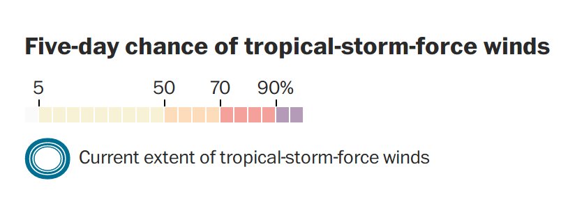
Finally it's very important that there is a *key* explaining what the shaded areas in the map actually represent. Such a key is badly missing in the NYT hurricane tracker, for instance. (5/5) https://t.co/CAY7GggFzU