How the Recession Reshaped the Economy, explained in 255 line charts in a giant scatter plot. http://t.co/0x5xbDL20d http://t.co/dweQyRdNI1
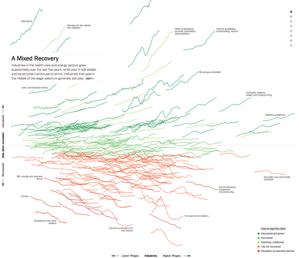
How the Recession Reshaped the Economy, explained in 255 line charts in a giant scatter plot. http://t.co/0x5xbDL20d http://t.co/dweQyRdNI1